Historical projects by MESO Web Scapes
Related Entities
- architektur aktuell
- atelier deLuxe
- beef-community
- bring-mich-ins-trockene …
- c&m Travel Design Website
- CMS Handbuch …
- CMS Handbuch Reha und …
- CONBEN
- CPF Finanzkommunikation
- Der Kassenarzt
- Der Vattenfall …
- Der Vattenfall …
- Deutsche Bank - Art works
- Deutsche Bank Brandspace
- Die Vattenfall Welt
- Die Vattenfall Welt
- Emma 01 - Keep the …
- Emma 02 - Run for …
- Emma 03 - "Look Ma, …
- Emma 09 - "Stacked …
- eyetoeye-pr.de
- Gardeners Website
- Goethe - …
- GRID Magazin Website
- growingtable.de
- hauser lacour …
- Helga Nienburg
- Hessisches …
- hfg5 Web System for …
- HLMD Information Website
- Hybrid clock
- Jardín de las Ideas
- Kinder-Pinguí Characters
- Kinder-Pinguí Game …
- Kinder-Pinguí …
- Kinder-Pinguí …
- Kinder-Pinguí …
- Kinder-Pinguí …
- Kinder-Pinguí Game …
- Kinder-Pinguí Game …
- Kinder-Pinguí Game …
- Kinder-Pinguí Game …
- Kinder-Pinguí Puzzle
- Kinder-Pinguí Weißt …
- Kinder-Pinguí Wo …
- Kinder-Pinguí …
- Kinder-Pinguí Russia …
- Kinder-Pinguí Russia …
- Kinder-Pinguí Russia …
- Kinder-pinguí.de …
- kindercountry.de
- Manifesta7
- Memory Loops
- Milupa Corporate Website
- Multiuser Environment
- Navero Promotional …
- Neues von Münchhausen
- NotOnOurWatch Website
- On Things Of(f) Things On
- Ougrapo
- Productpilot …
- s1nn.de (2007)
- s1nn.de (2013)
- Siemens - Windenergy
- Sixflags Google Gadget
- Sixflags.com Bulls Eye
- Sixflags.com Characters
- Sixflags.com SkyDrifter
- The Hunting Station …
- Tocadisco.com
- transform magazine
- Urbanshof Oberhofen
s1nn.de (2013)
Website for a German producer of connectivity and infotainment products for the car industry
GRID Magazin Website
The new German design magazine GRID gets a website in a very straight look, but with a little twist.
Goethe - Nationalmuseum / Media Guide
Digital Media Guide for the permanent exhibition “Lebensfluten – Tatensturm” in the Goethe National Museum in Weimar, Germany.
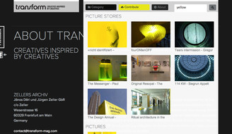
transform magazine
Completely revamped, restyled and reHTML5ed: transform-mag is the renowned brand new magazine for picture stories documenting creative doings. Revisit now!
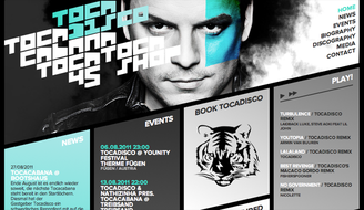
Tocadisco.com
New website for the well known House-DJ Tocadisco. Watch out! Thirteen degrees steep hill upwards.
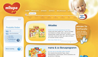
Milupa Corporate Website
Parents find lots of information about baby food on this fresh new website that Crossland and MESO Web Scapes developed for German baby food producer Milupa
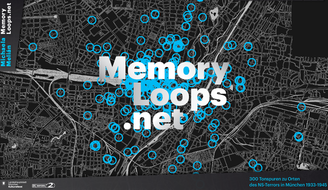
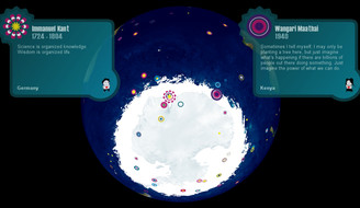
Memory Loops
Memory Loops is a virtual memorial for the victims of National Socialism. Michaela Melián’s audio work of art comprises 300 German and 175 English audio tracks which can be found on a map drawn up by the artist.
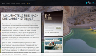
c&m Travel Design Website
Custom designed travels, the most beautiful places on earth: it’s all within your grasp with c&m Travel Design. Can a website design do justice to the beauty of our planet? We don’t think so, but that didn’t stop us from trying.
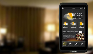
Navero Promotional Simulator
A software simulation and promotional website for a new product that helps tourists to explore foreign cities during their stay in a hotel or on a ship cruise.
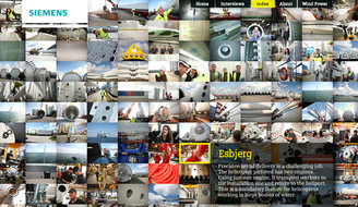
Siemens - Windenergy
A microsite about the Siemens windenergy-park off the coast of Denmark, based on interviews and a huge image collection arranged in a collage.
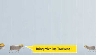
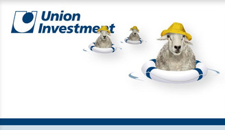
bring-mich-ins-trockene.de
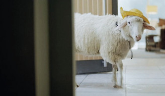
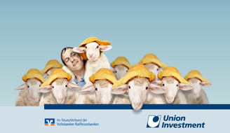
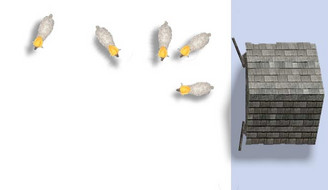
“To bring one’s sheep into a dry place” — a famous German proverb is used for a Landingpage and Microsite for the international investment company "Union Investment“.
[entity/kinder-pinguí_painting-book-promo/abstract:crd]
Emma 09 - "Stacked Stocking"
Emma is back. And she brought her sisters with her in this round of online banners for the international investment company “Union Investment”.
beef-community
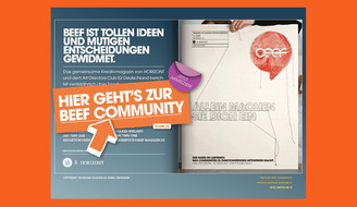
beef-magazine is „dedicated to tough ideas and exceptional communication”. The associated website – once only a short preview for the magazine’s next issue – got renewed and made interactive by MESO. The new site’s clear layout shows all the elements you’d expect from such a website.
Join in, get informed, get inspired and take part in the ongoing dialogue. See you at the beef-community!
hauser lacour corporate website
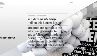
After 778 completed projects in 106 months, hauser lacour, one of the most successful German corporate design agencies is “…looking forward to everything that may come” – and they have good reason to do so.
On their website the agency now shows us its handsome new face: designed by the owner and carefully produced by MESO.
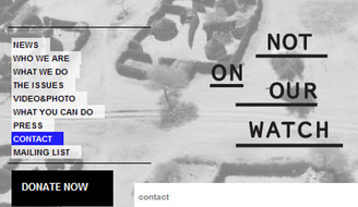
NotOnOurWatch Website
“Not On Our Watch”, the international advocacy and aid organization founded by George Clooney, Matt Damon, Brad Pitt and others, tries to focus global attention and resources towards putting an end to mass atrocities around the world.
STILETTO NYC did the design, MESO put it into code.
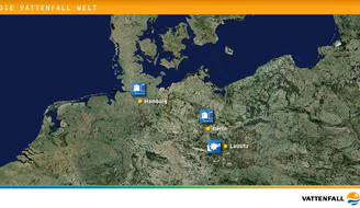
Die Vattenfall Welt
“World of Vattenfall” is an information terminal that shows the Vattenfall group’s activities in several places in Germany and Sweden showing points of interest like sports events and windmill-powered plants. Installed at branch offices in Berlin and Hamburg.
Die Vattenfall Welt
“World of Vattenfall” is an information terminal that shows the Vattenfall group’s activities in several places in Germany and Sweden showing points of interest like sports events and windmill-powered plants. Installed at branch offices in Berlin and Hamburg.
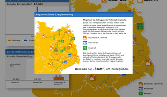
Der Vattenfall Frequenz Regler
The Vattenfall Frequency Regulator is an installation that lets the visitor interactively experience power regulation techniques in public power networks.
Der Vattenfall Frequenz Regler
The Vattenfall Frequency Regulator is an installation that lets the visitor interactively experience power regulation techniques in public power networks.
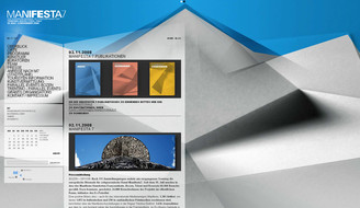
Manifesta7
The european biennale for contemporary art is finally back in 2008. Since the early nineties, the exhibition takes place every two years in changing locations and with different teams of curators. An exhibition as a dialogic process. Event and location mutually influence each other. This time, it’s Northern Italy’s Alpine scenery with it’s valleys and rivers: a perfect guideline for the interface-design.
kindercountry.de
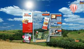
Just navigating through the high-resolution photographs makes you think you’d hear birds singing, crickets chirping and the gurgling of a clear water creek. But actually, this is a high tech flash based website that uses cutting edge technology to load huge images and to give the user nearly limitless navigation possibilities.
On Things Of(f) Things On
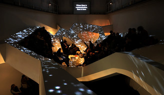
Ben van Berkel and the Theatre of Immanence – ON THINGS OF THINGS ON projection
The Hunting Station website
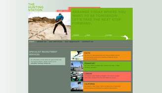
The Hunting Station’s approach is to go about in their business “in a friendly, consultative and efficient manner “. So we thought they might also like the friendly and efficient content management system we made for them using Ruby on Rails.
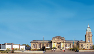
HLMD Information Website
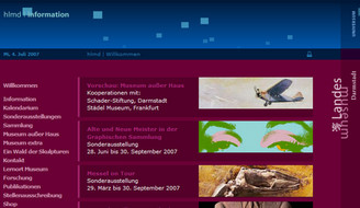
The information website of the “Hessisches Landesmuseum” provides all necessary informations about the museum to make the visit a remarkable experience.
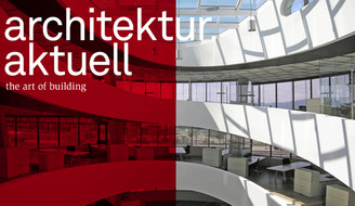
architektur aktuell
The website of Austria’s most famous architecture magazine finally was created in a cooperation between ade hauser lacour and MESO Web Scapes. Trying to get a magazine kind of style across we ended up with a clean and simple layout that keeps close t to the printed magazine (that was incidentally redesigned at the same time by the same people).
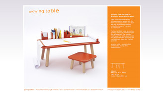
growingtable.de
Growingtable.de is a small website for designer Olaf Schroeder. It presents his product, the “growing table”. We did this little slideshow for him.
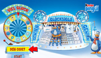
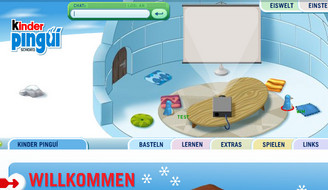
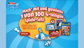
Kinder-Pinguí Sofortgewinnspiel
This flash application let kinder-pinguí code owners participate in an online raffle and gives instant feedback about his win
Sixflags Google Gadget
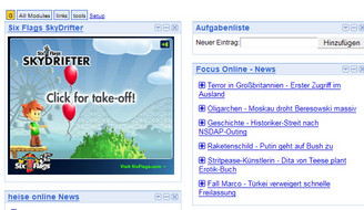
After we developed the SkyDrifter game for the new sixflags.com website we were asked to make an adaption so that it can be played in a typical google-gadget format.
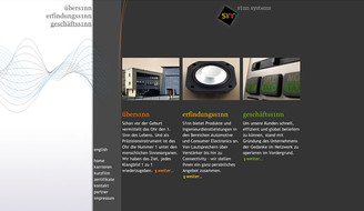
s1nn.de (2007)
Website for a German producer of connectivity and infotainment products for the car industry
Sixflags.com Characters
Sixflags.com Character Anmations: After developing two web games for the relaunch of sixflags.com, ogilvy NY asked us to create a entire family around our main game character. Then we animated the characters for teasing peoples to go to the sixflags parks.
Neues von Münchhausen
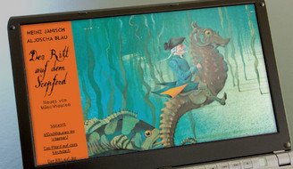
“Neues von Münchhausen – Der Ritt auf dem Seepferd” is a German children’s book by Heinz Janisch and illustrated by Aljoscha Blau. The book tells some known and newly “discovered” stories of famous Baron Münchhausen combined with beautiful illustrations of the adventures. We created a website accompanying the launch of the book by offering a new sketch drawing of Aljoscha Blau every week with a short part of the story.
CPF Finanzkommunikation
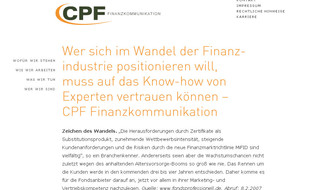
We did this small website for a startup company based in Hamburg developing marketing & public relation strategies. It is simple, clear and right to the point. And, as they specialize in communication, it contains only one single image. What a nice contrast to all those images overloaded yet content poor websites you see everywhere…
Sixflags.com SkyDrifter
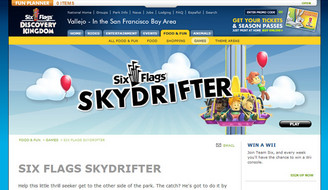
web-game for the famous entertainment park company. “Help this little thrill seeker get to the other side of the park. The catch? He’s got to do it by balloon. (So watch out for low-flying helicopters.)”
Sixflags.com Bulls Eye
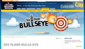
web-game for the famous entertainment park company. “Some animals think they can just walk from place to place without you knocking them flat with a fastball. Boy, are they wrong. Wind up and let it fly.”
Kinder-Pinguí Game "Tiefseetaucher"
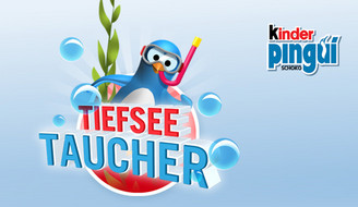
Little penguin is hungry. But in the arctic, the next supermarket is thousands of miles away. So let’s help our friend, jump through a hole in the ice into the cold water, swim fast and try to catch some tasty fish…
Tiefseetaucher is kind of an underwater-version of good old jump’n’run games.
Gardeners Website
Programming and content management for a colorful and bright website for Frankfurts most creative mostly girls agency. Grow pow wow now!
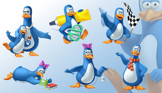
Kinder-Pinguí Characters
These are characters of the penguins we developed for use on the kinder pinguí website
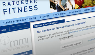
CMS Handbuch Fitness-Einrichtungen
The handbook “Fitness-Einrichtungen” is a collection of all important German fitness studiosOur project partner DG Medien integrated the database into the existing content management system we did für “Handbuch Reha- und Vorsorge”, also by MMI. Now the book is automatically generated and the data is available on a MESO-designed website at the same time.
Emma 01 - Keep the Sheep running
The first round of sheep banners was created in mid 2006 and featured a rainy screen and even let the sheep run across web pages
Emma 03 - "Look Ma, Swimming Sheep!"
The third round of sheep banners was created in late 2006, and this time things really get serious for poor Emma…
Emma 02 - Run for Shelter!
This time we learned from the first campaign: it is no good style to have your sheep standing in the rain. So we built some shelter for the poor creatures using huts, umbrellas or Flash movies to simply make them run faster so they catch less rain.
Ougrapo
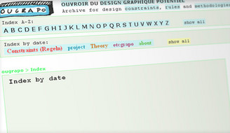
Ougrapo is an archive and a workshop for “graphic design under constraints”. They are a group of graphic designers searching for, collecting and applying methods and processes. The results are stunning, to say the least.
atelier deLuxe
It was a great pleasure to design this website, bringing the delightful light installations of atelier deluxe to the internet.
Productpilot prelaunch website
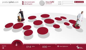
website with raffle to promote the upcoming business matching portal on productpilot.de
Hessisches Landesmuseum Darmstadt
The “Hessisches Landesmuseum Darmstadt” (museum of the state of hesse), lcoated in Darmstadt, is the central museum of the state and tries to keep up a universal knowledge approach.
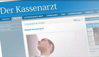
Der Kassenarzt
Website of the German magazine for physicians “Der Kassenarzt” with all the features of a modern website: news, essays, lots of information and the possibility to take part in forums and “tips for colleagues”.
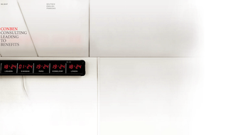
CONBEN
Their claim is “Consulting leading to Benefits” … and thats exactly what they do: helping mid-size businesses to unravel their hidden unused skills and possibilities.
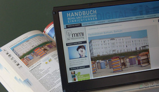
CMS Handbuch Reha und Vorsorge- Einrichtungen
The book features over 1.700 German and European rehabilitation clinics and is used by physicians to find a matching clinic for their patients. Together with our partner DG Medien we developed an extension to our aspekt:ration CMS to enable the clinics to administer their data for the book themselves. The book is then produced (more or less) directly from our database.
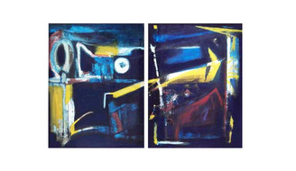
Helga Nienburg
Munich based artist Helga Nienburg is a painter who refuses to follow any outside constraints and temporary hypes, leading to unique impressionist paintings that are hard to classify. The website gives the images as much room as possible.
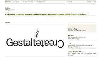
hfg5 Web System for HfG Offenbach
Conception and creation of a visually reduced but detailed web and collaboration system that suits the needs of both the people who work and study there and the ones that don’t (yet).
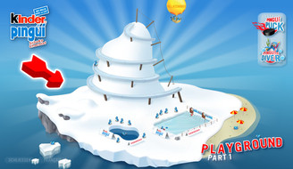
Kinder-Pinguí In-Pack-Promotion "Playground"
A snow island playground designed and delevoped for a CD-ROM giveaway in family packs of chocolate bars.
Kinder-pinguí.de Fusball Promotion
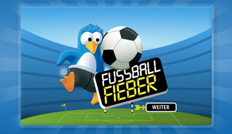
This is a Flash application, which was embedded in a microsite for FERRERO Kinder-pinguí promotion purposes in 2006. Participants could win their own personalized football shirt by allocating metaphoric football descriptions to images.
Kinder-Pinguí Promotion "Weltraum"
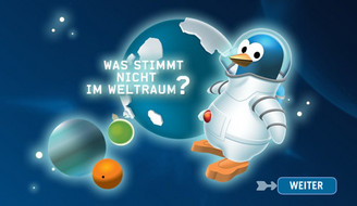
A classical two pane compare images game made in Flash.
Kinder-Pinguí TV-Spot "MakingOf"
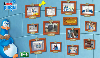
The “MakingOf” the Kinder Pinguí TV Spot as an interactive online documentation.
Urbanshof Oberhofen
It was a little bit like connecting to time dimensions together when we did the little webpage for a restaurant and hotel located right in the heart of the Pfälzer Wald. They felt like it’s time to enter the Internet, and we were very pleased to come to aid. DO NOT OPEN THIS PAGE WHEN YOU ARE HUNGRY! Their meals sound so delicious all the time.
]
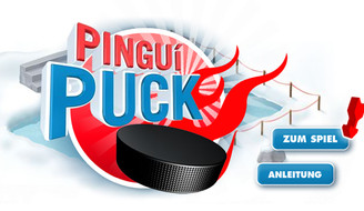
Kinder-Pinguí Game "Pinguí Puck"
What does immediately come to your mind when thinking of ice hockey and penguins? Right, Pinguí Puck of course.
Five different levels to get a good score, this motivates every player and is the way to his place in the highscore list. To get there, as many ice blocks as possible have to be hit as fast as possible in good old “breakout”-manner…
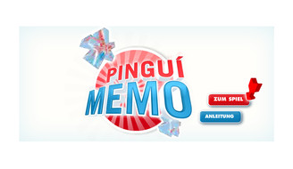
Kinder-Pinguí Game "Pinguí Memo"
Every snow flake is unique. Each one? No. In Kinder Pinguí Universe, there’s always a pair of them, and when playing Pinguí Memo, your task is to find it. Discovering the tiny differences between the crystals is too easy for you? Just switch to a higher level and try to finish in less time!
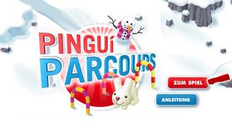
Kinder-Pinguí Game "Pinguí Parcours"
Feel the adrenaline when using the arrow keys to make your bicycle riding penguin follow a path to collect all the points while snowmen and aggressive arctic hares are after you. If you manage to keep your heartbeat low, maybe one day you’ll make it to the hall of fame of highscore gods.
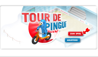
Kinder-Pinguí Game "Tour de Pinguí"
Tour de Pinguí is a single player game developed for Ferrrero. First, we put the furious “snake” concept into an isometric space. Then, we abandoned that greedy snake to change a “killer game” into a “kinder game”.
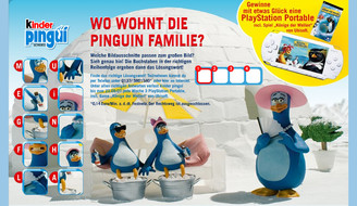
Kinder-Pinguí Wo wohnt die Familie?
Another little promo game: Find out where mother penguin lives with her husband and the two children. Look at the image and decide which of the details shown at its left is really taken from the original one.
Kinder-Pinguí Puzzle
An interactive drag’n’drop puzzle game for Ferrero Kinder-pinguí and a Schmidt Spiele Promotion.
Kinder-Pinguí Weißt du Bescheid?
What do you know about our friends, the penguins? A little questionnaire for Kinder-pinguí with funny questions and nice illustrations.
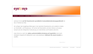
eyetoeye-pr.de
Making eye contact is still one of the most important factors in human communication. So this small startup company based in Frankfurt uses this metaphor to show how they understand communication: eye to eye with the client. Their website however is much less metaphorical: a solid and easy to use system based on good design and a PHP content management system.
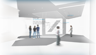
Deutsche Bank Brandspace
Deutsche Bank Brandspace
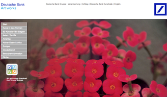
Deutsche Bank - Art works
Deutsche Bank – Art works
